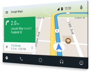
Android Auto V. Auto Mate
Android is a vast platform and in just the past year it’s spread to an array of platforms including Android Wear, Android Tv and now Android Auto.
 Android Auto, unlike most apps on your phone, doesn’t have the goal of keeping a submersed, interactive UI. Instead, it’s quite the opposite. Android Auto intends to keep you focused on the road with as little distraction as possible.
The creative new interface remains somewhat familiar. After connecting your device to compatible cars [see http://www.android.com/auto/ for a list of companies ] it will take over the display in your dashboard.
Android Auto looks much like a blown up simpler version of Google Maps. You can tap the speaker button, or use a compatible button on your steering wheel, to speak. Audio commands such as, “Find me directions to Yosemite National Park.” or “Where can I find the nearest Starbucks?” will trigger a response from the lovely Google Now voice and show a list of results sorted by distance.
On the bottom is a very minimalistic dashboard with five on screen buttons. Maps, Phone, Home, Music and Dashboard. The Music icon also acts as a drop down menu that you can use to get to other apps compatible with the system you have on your phone.
Overall the experience of Auto is smooth, and beautifully designed in Google’s Material structure. It’s easy to use with minimal distraction. Unfortunately Google Now’s voice controls, although work well most of the time, is still a little slow and I found myself focusing just a little too much on making sure everything was working the way it should. Then again, this is the case for all my devices, including Android Wear. Voice controls are the best they’ve ever been but aren’t as smooth as I’d like them to be quite yet.
Third party apps such as Spotify, Pandora and iHeartRadio are available and working with Auto already. They aren’t too much different than the standard UI so that they don’t distract, but have just enough of a unique touch that you really feel like you’re in a new app. And conveniently Auto seems to work really smoothly with the cars functions such as the rear camera.
 Auto Mate is a clone of Android Auto designed to be usable on a tablet or phone for people without displays built into their car. It feels and looks a lot like Android Auto but it’s still in beta and it shows. The app is still a bit buggy and unless you have a phone app on your tablet with data it won’t have a lot of the features you’ll need. The Map button on the Auto Mate UI links you over to the Google Maps app which then directs you with turn by turn navigation. This feature is not the worst part of the clone, but instead quite useful and appreciated. It’s the music button that lacks significant quality. Instead of having a display that shows the album artwork or even a title of who you’re listening to, the audio only is streamed over from the Google Music app. The developer did manage to get the suggested locations nearby and voice controls to work pretty smoothly however. For an app in beta created as a low end alternative, AutoMate is a good option. You can join the Google+ community and try out the app here.
Overall Android Auto is a great experience and will be in numerous cars coming out in the next few years. The best part, and the feature that sets it apart form Apple’s rival, CarPlay, is that Auto is stored on your phone and can be used in any car with a display and a USB port.


